In this post I’m going to set out a few of the issues I see with the use of Progress 8 data, especially as one of the indicators of school effectiveness in inspections and in general school-to-school comparison and evaluation.
For further reading on Progress 8, you want also wish to read the following:
- My blog, Dissecting Progress 8: The good, the bad and the ugly – where I explore the issue of outliers.
- An earlier blog : Progress 8: Looks like data garbage to me – where I explore the convoluted P8 mechanism and the tenuous link to any actual learning.
- I also recommend the many Datalab posts on the subject including this latest post by Dr Becky Allen: https://educationdatalab.org.uk/2017/01/outliers-in-progress-8/
Update: This post by Dave Thomson at Education Datalab is a must-read: https://educationdatalab.org.uk/2017/03/putting-progress-8-in-context/
- Progress 8 is an inadequate average measure – massively open to distortion by outliers.
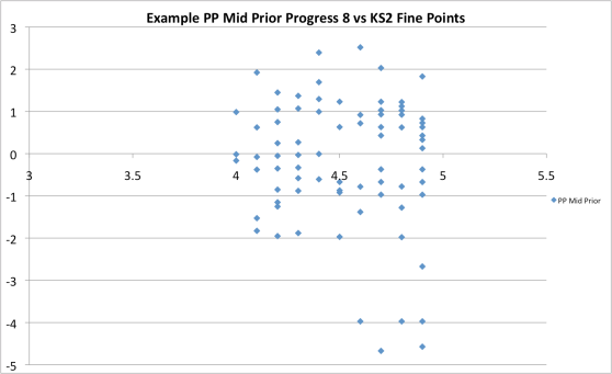
Take the sample data above. This is based on real school data via a Headteacher colleague but the figures and details are changed. On face value, P8 for this sub-group of 80 students is -0.20. That’s certainly below average with a degree of significance. A report might state: Middle Ability Disadvantaged students make below average progress based on this data. But, actually that’s not quite true. It only takes five students out of 80 in the group to distort the average. These five students each have very low P8 scores – signifying major issues with final exams. Any number of factors could be at play but they wouldn’t be related to standards as such; at this scale it would need to be missed exams, massive exam blow-outs and so on. Outliers ‘lie outside’ the main pattern of a data set. It’s fair to say that these five students don’t represent general standards or issues for this group. 75 out of 80 students – those that constitute the core group of this sub-group – actually score P8 + 0.07. It’s not even negative. The crude, raw average doesn’t really tell the story of achievement for the group – unless it is broken down and explored.
Clearly outcomes for those five students matter – but their numerical attainment scores have an undue effect on what is an arbitrary numerical representation of ‘progress and standards’ and this needs to be recognised if we’re going to talk sensibly about these things in the context of school improvement.
2. Averages mask profiles and the spread of performance within a cohort.
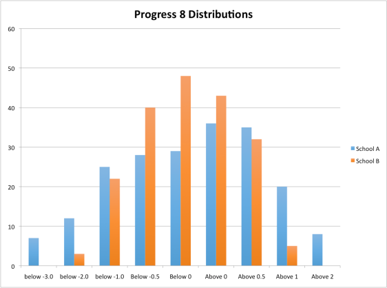
Consider two schools, A and B. Both have the same P8 score of -0.13. However, if we look at a profile, School A has a very different make-up to School B. School A looks to have some very low-scoring students; possibly outliers if studied in depth. The core progress for School A looks to be just above zero, pulled down by the outlier effect above. In fact, School A also has some strong P8 performance at the top – the school is capable of delivering this outcome for some students. School B is more solidly centred evenly around the mean value; it’s more likely that P8 represents a more typical progress outcome because the spread is much smaller.
I’ve always argued for profiling all data outcomes – instead of the stupidity of condensing all student achievement into one number – and now P8 is here and is already being used in its crude average form to inform judgements on schools by inspectors, my worst fears are being realised.
3. Just possibly, the KS2 Input is the biggest factor, not anything the school does:
When we look at the range of KS2 outcomes, do we really think that children’s abilities and learning are so different from region to region – or it is simply that some schools are better are converting learning into the specific form of SATs outcomes? Let’s just assume that some primary schools generate better outcomes from students of broadly similar capabilities – it’s not a big stretch.
Now look at this part of the Progress 8 alchemy-algorithm :
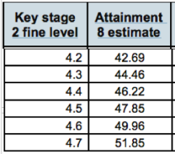
Let’s say a school has an average KS2 fine level intake of 4.5 (remembering that this derives from an average of two made-up numbers derived from two raw scores in Maths and English that measure totally different things – and you times by six or something….). The median A8 expected is 47.85 -(four sig figs..??). But it’s not inconceivable, given the national variation in KS2 outcomes and the differing degrees of pressure schools feel to prime-pump the SATs machine – that another secondary school inherits very similar students with an average fine score of 4.6. (Pretty much the same right?). This, however leaves them needing to achieve an Attainment 8 median score of 49.96 – just over two points higher. But that’s equivalent to two more GCSE grades across 10. In Progress 8 terms that’s equivalent to +0.2 (because you just divide by 1o). So, without doing anything special at all, the school that receives the 4.5 KS2 intake has a 0.2 advantage over the 4.6 KS2 intake, assuming they actually have broadly similar students. Bearing in mind the coasting schools threshold is -0.25, this is pretty major.
- I think this is significant. A shift of 4.5 to 4.6 is small; 4.5 to 4.7 would also be conceivably possible with even bigger swings in P8. I’ve looked at data for hundreds of schools and I reckon, if all truths could be known, we would find that lots of schools in England get decent P8 scores without really working too hard for it; it’s simply a function of having averagely hard-working students who went to primary schools that weren’t very pushy and pressured. Meanwhile, elsewhere, schools are busting a gut just to get level in an environment where the primaries are also busting a gut a bit more to satisfy the accountability machine and the outcomes are notched up just a bit more.
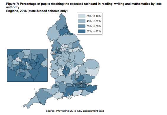
In other words, we don’t really know how much of P8 is due to the accuracy of KS2 data as an effective baseline for secondary schools rather than being very much to do with the secondary schools’ provision and standards. Everything in P8 rests on those KS2 test being absolutely rigorously consistent across the entire nation. I’m doubtful. Just look at the map – and imagine what the more detailed picture would be.
4. The Disadvantage Factor. Let’s not pretend this isn’t a real thing:

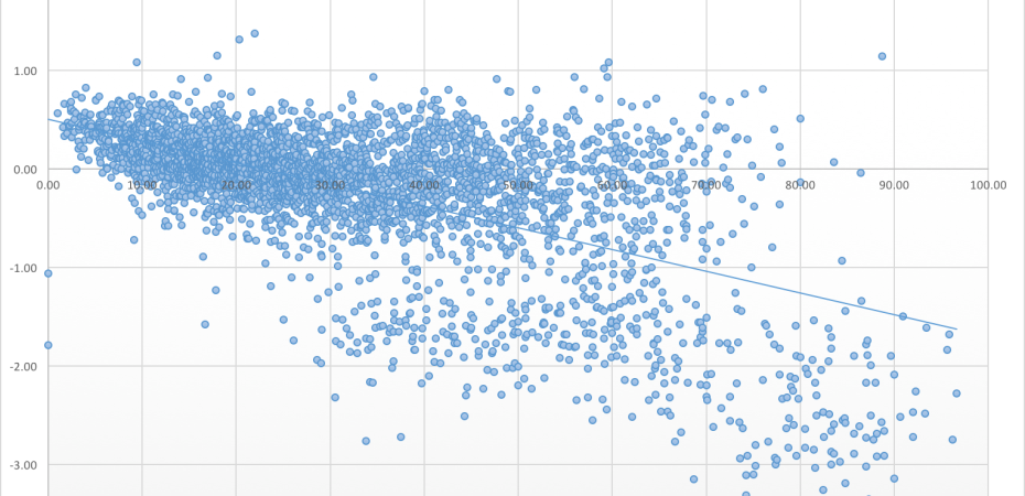
Repeating the scatter-graph from the top of this post, this data comes from the KS4 performance data on the DFE website. I made this myself – a simple plot of over 3000 schools’ P8 vs the % of ‘ever 6 FSM’. The pattern is clear. For schools with 20% or fewer PP students, over 75% of them have positive progress 8 scores. For the schools with 60% of higher PP students, less than 30% have a positive progress 8 score. It’s just a massive factor. If you combine this with the primary school factor above, we’ve got two major inputs – the KS2 baseline and the level of disadvantage – that pretty much shape a school’s P8 parameters before anything happens in lessons. I’m absolutely certain that success in P8 is super easy for some schools in certain situations; a quantum universe away from those that struggle – they are not better schools; it’s just that they don’t need to try as hard.
It’s obviously inspiring to see how well some high PP schools do. There’s a box of just a few schools above 70% PP with positive P8 – well done to them. But, tempting at it may be to imagine all schools could emulate them, this is an illusion. Once we add in Ofqual’s comparable outcomes approach that sets a de facto limit on the number of top end grades that are available on the bell-curve, it’s clear that not all students can meet and exceed the median Attainment 8 score (by definition of median); there is a repeated zero-sum effect that means that, nationally, about half of the students for any starting point, must get a negative P8 score. This is more likely if they live with real disadvantage – (and if their SATs results were just a tiny bit better than someone else’s.)
It’s clear from this graph that high levels of FSM have an exponential impact on outcomes. It’s not a linear effect. Once you go beyond a critical mass of non-FSM students, the P8 scores fall off a cliff. And yet – judgements are made as if all these things are equal. No excuses.
So -there we are. I described P8 as data garbage once. I was chastised for doing so. But, please, let’s at least see it for what it is – and let’s not continue to judge and rank schools using crude single figure numbers without knowing about their profile and their context. I can’t help thinking that, one day, when we’ve finally established an education system that is truly world class, P8 will be long-forgotten; a slightly embarrassing hang-over from the days when we lost the plot with uber-accountability. Sadly, that time is rather a long way off.
Significant Update:
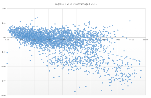
Having studied this further, prompted by someone suggesting the P8vsPP graph had two distinct populations, I’ve separated the 400 Special Schools which I hadn’t done before. Clearly that makes a big difference so here are the separate graphs:
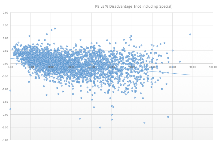
The regression line is less steep but there is certainly a significant pattern especially given the scale that determines coasting schools (-0.25) and the impact of KS2 inputs as described above where a +/- 0.2 is easily lost or gained. 43% of non-special schools have positive P8 for schools with over 60% PP – compared to 75% of schools with PP below 20%.
The special schools are distributed below. There’s a similar pattern but the scale of P8 is very different.
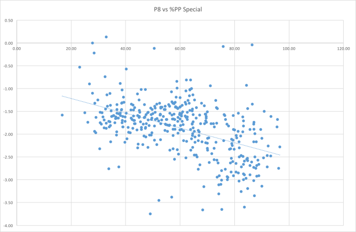
As an aside, it’s interesting to note that there is only one special school where the PP% is below 20%. Is this a function of more affluent parents using independent schools for children with high levels of special needs?
Update: The March Ofsted bulletin for inspectors shows that they have now recognised the outliers issue and have asked for this to be taken into account:

I wonder what all this looks like with proper propagation of uncertainties in the estimation of KS2 and A8 outcomes. Probably a great big smear with very few ‘statistically significant’ outliers?
LikeLiked by 1 person
Has this not always been so true and yet so simple?
1. Primary schools are under pressure
2. Primary schools results are not always reliable – especially with PP pupils who often sit their tests in other rooms with lots (and I mean LOTS) of support!
3. Secondary school data is therefore ergo sum flawed.
4. Secondary schools have to “suck it up” – anything is just an excuse!
5. If students do badly – your fault.
6. If students d well- weren’t they a lovely year group?
Or am I just a cynical old has-been…..?
LikeLiked by 1 person
That’s exactly how it is.
LikeLiked by 1 person
How do they do it abroad where education standards appear to far outweigh our own?
LikeLiked by 1 person
[…] graph produced by Tom Sherrington illustrates […]
LikeLike
Sometimes the KS2 data is a load of rubbish. My parents were repeatedly told that my brother should have been doing much better at KS3 based on the KS2 SATs data.
The problem was that the KS2 data was a load of rubbish. Brilliant SATs results achieved at the expense of all else. Anything other than English, Maths and Science was not important. Drama, Sport and Music all side-lined and what kind of education is that? Far too much emphasis on passing the exam rather than embedding subject knowledge.
LikeLiked by 1 person
Really glad to see this – great blog
For figures on the range of VA scores one typically gets nationally, see p197 onwards (and pg 203 for graphical examples) of this:
Click to access Perry16PhD.pdf
(divide by 60 to get to scale roughly in line with A8)
Also, relevant:
http://onlinelibrary.wiley.com/doi/10.1002/berj.3247/abstract
We also need to link up the issues of bias, stability and consistency (less bias=less stable).
LikeLike
Progress 8 measures what it measures. It is a school’s average Attainment 8 score adjusted for the KS2 results achieved by its intake. Nothing more than that. Now I think that’s pretty useful but problems arise when inferences are made that it was not designed to support, e.g. when interpreted as a measure of overall school quality. Given the data we have on pupils and schools it seems frankly implausible that the contribution of a school to pupils’ attainment can truly be isolated in a single measure. Understanding a school’s performance is far more complex and has to be approached using a range of measures.
LikeLiked by 2 people
Absolutely. In my experience it’s the averaging that causes the problem. But actually it’s the original data construction that’s really at issue. KS2 =4.5 for a child is too crude and approximate as a measure of learning and achievement relative to the weight placed on it. Most data consumers will take the data at face value, ignoring validity questions and ascribe meaning to it as it the numbers are concrete absolute measures.
LikeLike
It would be worth looking again at different ways of including the KS2 results in the calculation, including using more refined measures. I would suspect that school average P8 scores wouldn’t change much.
LikeLike
Plus the progress only counts over the prescribed subjects… this doesn’t seem to come up much in the commentaries.
LikeLiked by 1 person
Agreed. And I would add that the DfE is actively encouraging misplaced interpretations when such measures are placed in ”school performance tables’ which purportedly allow the public to ‘Compare school and college performance’.
The only suggestion that this is not the case is the confused explanation of confidence intervals, which only reinforces the impression that differences relate to differences in school effectiveness (i.e. ‘It is difficult to say with certainty how much of the Progress 8 score is down to the school (which may have scored higher with a different group of pupils) and how much is down to the pupils (for example some may have performed well at any school).’)
I agree that a range of measures would be step in the right direction (adding a Contextualised Progress 8 perhaps) as would trying to show distributions rather than averages, as Tom and others have suggested.
LikeLiked by 1 person
It would be useful to do this exercise by the % of LAP/MAP/HAP/ students and by the type of school. This would support your findings.
LikeLike
Worth noting that the map of KS2 results for 2016 is less reliable than normal, but also doesn’t match with the baseline for Progress 8, which is based on Reading/Maths only. The map includes the chaotic writing results.
It doesn’t make for a perfect system, but hopefully a less ridiculous one than it first appears.
LikeLike
Thanks Michael. I was originally going to use an earlier map – it’s really meant to illustrate the existence of regional variation in KS2 outcomes rather than the extent of it. Someone should do a proper analysis vs P8. I think P8 in 2021 will be a bit of a carve up!
LikeLike
Indeed, I’m sure it will. Much like KS2 progress measures in 2020.
I’ve said it before, but it stands repeating: #dogsbreakfast
LikeLike
A few comments.
1) P8 is an average. Like every average in the world, extremities matter. There are basically two options: either you have a threshold measure (5ACEM) or you have an average. Do any readers think a threshold measure like 5AC is a fairer means to assess schools? That is not what I hear when I go out and talk to schools.
2) Disadvantage: as you note, when you take out special schools, the gradient falls by almost two-thirds from your initial claim (if my tape measure on the screen is right!). That is a big reduction, and shows the importance of getting the sample right. (I think you should delete the first graph, tbh).
If we just look at comprehensive schools, the line will be flatter still. Folks who want to check can download the data from the dfe website here: https://www.compare-school-performance.service.gov.uk/download-data?currentstep=datatypes®iontype=all&la=0&downloadYear=2015-2016&datatypes=ks4 and sort first by RECTYPE (retaining only those that are 1 to exclude special schools), and then sort by P8MEA. You will see that the schools with a score of -1.4 of worse are overwhelmingly (and perhaps exclusively) specialist schools, mainly studio schools. These schools draw disproportionately poorer children, and so distort even the revised disadvantage line in your post. If you take them out, the fit of the regression will improve, and the co-efficient will fall. Similarly if you take out grammar schools, so that we look only at mainstream comprehensive schools, the co-efficient will fall further.
We also know that many of schools with a greater proportion of poorer children had a less “P8 friendly” curriculum, and that some are still adjusting their curriculum. For that reason I am confident that many mainstream schools with high concentrations of poorer children will see their P8 scores improve next year, just as they did last year. So the line will be flatter still in future – perhaps only half as steep as the current “comprehensive only” line. Progress 8 appears to be leading to a nation in which social class is a less strong predictor of the curriculum you will receive at school. I think that most people would see that as a good thing. Becky Allen has also shown that schools that have made the most progress to a curriculum that fills the ebacc buckets in P8 have seen the fastest rises in English and Maths grades, presumably because pupils spending more time on history and spending more time writing, etc. Poorer children are the main winners from this. A higher proportion of children from poorer backgrounds doing a curriculum that means that they do well in English and Maths seems good to me.
3) As someone said earlier, your map includes writing, which isn’t part of the P8 methodology. That is not valid. It is also % reaching threshold, so is a poor guide to the point you are making, since P8 is not a threshold based measure. I don’t have any difficulty believing that differences by ethnicity, income, etc by regions can drive very different results at 11 even if all schools across the country are equally good. If you are right, there should be an inverse correlation (at (say) LA level) between KS2 and P8. I don’t think anyone has ever found such a thing. It didn’t show up in any of our prior-to-introduction modelling of P8. Does anyone want to check the data and provide evidence either way?
4) To the person who says “How do they do it abroad where education standards appear to far outweigh our own?” – there really aren’t many large countries that are consistently above us in things like PISA. And Pisa certainly suggests that England is doing better than the other nations of the UK, both in levels and in terms of direction of travel. Of course we should try to learn from abroad, but let’s not claim that education standards “abroad” “far outweigh” our own: that is not true as a general statement.
No-one is claiming, has ever claimed, or will ever claim that Progress 8 is perfect, or that any number can ever sum up a school in its entirety. And data are only ever the basis for a conversation. And of course we want to improve Progress 8, subject to trying to provide stability.
Hope this helps
Tim Leunig
Chief Analyst and Chief Scientific Adviser, DfE
LikeLike
Thanks Tim. A couple of follow-ups:
1. We all get that P8 is an average and that threshold measures have other types of flaws. However, when an average can be skewed so massively by a very small proportion of the cohort, there are big issues in treating P8 as guide to typical standards in a school or for sub-groups. Some schools will be more affected by this than others. It’s not a case of wanting a threshold measure – I’m concerned to move away from any single figure data points to define schools which is what is happening.
2. I think it was valuable to plot all P8 scores vs all %PP values – just to see what the connection between them looks like. Separating out types of schools starts to fix things of course. I don’t think we can take out Grammars – they represent a big factor in linking positive, easy-win P8 to very low disadvantage. Of course if we take out the schools that make the line steep, we get a flatter line. I get your point that it might level out. Let’s all hope so. However, even within the comprehensives, we would start to stretch out the y-axis here. When the scale for RAISE being sig+/sig- is in the region of +/- 0.2 for numerous measures and coasting schools definitions use -0.25, we’re still looking at a significant gradient relative to typical P8 values.
3. The map is only there to illustrate the range of the disparity in any given measure. I don’t have access to a KS2 fine-point score map. Are you not concerned that a 4.5 to 4.6 jump makes as much as a 0.2 difference in P8 and that, therefore, P8 may be measuring KS2 fluctuations as much as school performance? It could be quite localised, averaged out at LA level. The point is we don’t know. Given the super-intense pressure some primaries can be under, I think we’re entitled to ask questions about the robustness of using the KS2 fine points as a valid baseline for the massive P8 machine that rests on it. Surely the DFE should be exploring this in some detail to be sure that the whole thing isn’t a house of cards.
4. We may be doing great stuff compared to other nations but I’d argue that the pursuit of single measure metrics to evaluate schools isn’t part of any success story we’re ever going to tell. No other country does this. For good reason. I know you invented P8 and will defend it but sadly it’s not merely the basis for a conversation. It’s already the basis for deciding schools are good or bad in pretty crude terms, in the hands of people who often barely understand it or get how far it is removed from the complexities of what children actually know.
LikeLiked by 1 person
Another technical note. If we remove grammars and special schools, don’t we have to remove their students’ data from the median A8 calculations for each KS2 fine point score – assuming that all children are included to begin with. If we remove special school children, then the median A8 scores would rise – giving schools with higher proportions of lower attainers lower P8 scores. Similarly, grammar school children will be raising the median scores for high prior attainment; removing them would lower the medians so P8 for schools with lots of high prior attainers would rise. This effect would off-set any flattening – it would be interesting to see the scale of it.
LikeLike
The results of pupils in special schools aren’t included in the calculation of P8 estimates. Note that means are used not medians.
LikeLiked by 1 person
Thanks for the clarification. That makes sense. We have to treat special schools differently then but not grammar schools because they are part of the data set.
LikeLike
I thought best statistical analysis always removes outliers? Why can’t the extremes be removed from the data set to give a more meaningful measure? Either individual students or nationally the uniques schools or special schools ?
Staggering that the DFE still believe an average measure is good or that all students should follow the same academic curriculum and 8 examinations.
LikeLike
The outliers issue is a big one for me. I’ve spoken with one school which claimed that almost 85% of the PP eligible students had positive progress scores yet the overall P8 score for the PP cohort in school was below zero as a result of two outliers.
In most sets of data you could get outliers at either end of the specturm – not P8 outliers!
Part of the reason that outliers are having such a wild impact is that, because of how P8 is set up, you can only really be an outlier on the ‘down side’ (a student of given KS2 results basically taking 0 or close to qualifications for whatever reasons – there is almost no way to manufacture a set of results for that same starting point that would generate outliers in the other direction).
Threshold accountability measures are flawed because you effectively ignore larges parts of the cohort – success/failure comes down to how well you convert the C/D borderline (or whatever) kids in the middle. I’ve heard of farcical outcomes such as A*-C maths results go up, A*-C English results go up, 5A*-C go up but ‘headline’ 5incEM goes down because of poor overlap between the Maths and English results. ie. the school has cearly got much better results this year but the accountability computer says no! Clearly that is something we couldn’t want of a sensible accountability measure!
P8 has it’s issues – outliers; gaming like ECDL still floating around for a little longer; issues about whether the baskets are right or not – but it is certainly better than the old measure and, if we are to have a single ‘main’ headline measure then it’s less bad than any alternatives I have seen (especially if we can tidy it up).
I would agree there are issues around contextualisation.
There is certainly a debate to be had about whether we should contextualise in the calculation (‘Your contextually adjusted P8 score is …’ which concerns me a bit as you can’t get a sense for how much the context has impacted on the final figures) or whether you should contextualise the analysis (‘Your P8 score is …. which places you in the top ….% of similar schools nationally).
Currently I lean to the latter – but it’s not a steep lean!
To look at Tim Luenig’s point – and hat’s off that he engages openly and freely in these discussions – the “P8 friendly curriculum” is probably a valid one – and curricula nationally are converging (I make no comment about the rights/wrongs of this here). I imagine this is quite largely restricted to the EBacc basket. We could explore what P5 (Maths, Eng & Open combined) looked like against disadvantaged to see whether differences in the EBacc basket are driving the disadvantage patterns you note in your blog.
Steve
LikeLiked by 1 person
Thanks for this. I agree that P8 is better than the threshold. It’s just the lack of sophistication applied to it that bothers me. Averages are terrible measures in lots of contexts; all detail is lost. For me the biggest problem is the KS2 baseline. It’s way too unstable for the pressure being applied to it. It will be interesting seeing how P8 values and rankings fluctuate over time.
LikeLike
Re: averages – yes.
An exaggerated example:
Consider school A where every student had a P8 score of 0.00
Now consider school B where half the students had P8 scores of +1.00 and the other half -1.00
Both schools have overall P8 scores of 0.00 but very different things are going on!
School A is ‘steady away’ school B you either fly or crash – nothing in between!
I’d argue that school A can probably be safely left alone if they are not due an inspection on the rota. School B really needs a visit to see what is going on!
LikeLike
[…] thought we’d run out of things to say about Progress 8 but a couple of blogposts from Tom Sherrington and Jim Gordon last week made us realise that we hadn’t. Both examine, among other things, how […]
LikeLike
[…] are unreliable? I am in favour of progress 8 as a tool to gauge progress of all students, but it is not without its flaws. A process that can still damage a school’s reputation and teacher’s […]
LikeLike
One issue we have identified with our data is the impact of a low KS2 score in English and a good score in Mathematics. It appears to us that the P8 score for students with good maths and low English is much lower than those with a good English and low maths. Therefore two students with very close fine point scores end up with a very different P8 score. We are not sure if this is a national picture or one that is peculiar to our last set of data.
Any comments welcome.
LikeLike
That makes sense -English is likely to impact wider learning in more P8 subjects than maths. It would be interesting to look at this nationally. eg if we double-weighted English or double-weighted Maths – which would yield higher P8? The exception would be if the lower English is an EAL issue when you often see students make rapid progress – EAL students on average have bigger P8 than non-EAL. (Datalab).
LikeLike
[…] What about the outliers and the impact of KS2 results? Tom Sherrington provides a great explanation here. […]
LikeLike