(UPDATES – see DataLab posts via link at the bottom for an interesting challenge, my response to it, and other bits of analysis..)
I’ve been looking into the detail of Progress 8, following the DFE guidance that was published in March. Is it just me or is this a massive pile of data garbage? A house of cards of data validity dressed up to look rigorous? I’m seriously worried that we’re being duped by the wizards of Data Delusion. I’m also hugely disappointed. A while ago, I attended a Heads’ Roundtable gathering where DFE data-King Tim Leunig outlined the ideas behind Attainment 8 and Progress 8. It all sounded pretty sensible: measures that encompass a broad range of subjects (not just five), where every grade counts (not just C+) and where progress against prior attainment would take priority over narrow benchmarks.
I’ve waited to see the details behind the mechanism and now that I have, I’m horrified. It’s all so convoluted; so removed from what learning looks like, turning ‘Progress’ into some kind of absolute metric.
To begin with, there is an input measure – a fine sublevel – that is derived from the raw scores on two tests in different subjects. If you read my posts The Data Delusion or The Assessment Uncertainty Principle, you will see how far we move away from understanding learning even with raw marks. However, it appears that raw marks in different subjects are to be put through a convoluted mincing machine where 74 and 77 become 5.1. One number representing EVERYTHING a student has learned at KS2. On average.

Then, we take these fine sublevels and line them up against the pattern of outcomes at GCSE over time. Using the new Attainment 8 measure (uncontroversially adding up points scores for GCSE grades; arbitrarily giving extra weight to Maths and English), we get an estimated outcome for each KS2 fine sublevel. Sounds reasonable – but look at the table. FOUR SIGNIFICANT FIGURES????? For an Estimate??
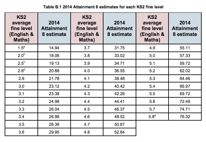
Let’s spell this out. A student with a fine KS2 level of 4.7 might be expected to get an Attainment 8 score of 50.67, whereas a student whose data mangle yielded 4.8 might be expected to achieve a score of 52.84??? You have GOT TO BE KIDDING! For an Estimate?? It’s the nerdiest data joke ever – told on a national scale. Any A level scientist could tell you that you can’t exceed the accuracy of your measuring devise simply by using it over and over again and you can’t ever increase accuracy beyond the limit of any one piece of data in a calculation. The best you could hope for in this mapping exercise is to say 4.7 maps to 51 and 4.8 maps to 53 – (and that is assuming that, on average, linear progress for a whole cohort is actually ‘expected’. Actually ‘to the nearest 5’ might be more reasonable.
For me, the whole credibility of the Progress 8 is ripped to bits by this table; the people who have designed it appear to know no more about data than my eager Y12s who can’t bear it when you tell them to ignore all the dazzling decimal places on their calculators – because they aren’t real!
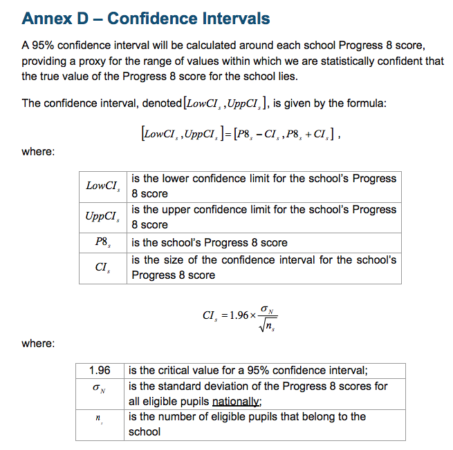
But there is hope. The DFE does recognise that Statistical Significance needs to be applied. There is a whole Appendix dedicated to it in the guidance explaining the concept of a 95% confidence interval and the use of error bars to highlight significance:
This all adds weight to the delusion. It says ‘we’re serious about data; we’re not dumbing it down; we know that errors matter’. There’s a handy graph to really spell it out:
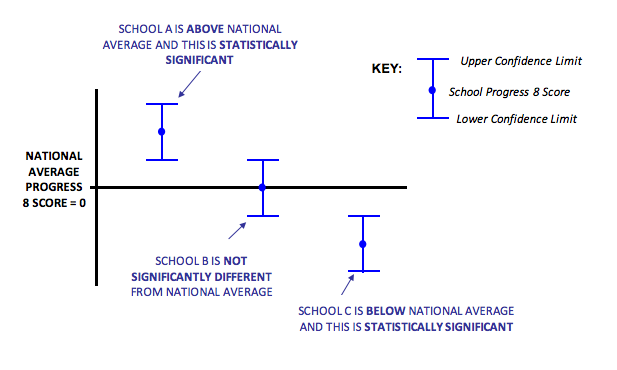
But then we get to the crux. Despite all the four sig fig nonsense, we actually end up with an outcome, in the worked example, where Progress 8 is 0.3 +/- 0.2. In other words; 95% certain to fall somewhere between 0.1 and 0.5. (Coincidentally, these are the same numbers for my school.). What we end up with is a super-crude 1 significant figure number falling somewhere within a range that is bigger than the number itself. Essentially, the whole palaver divides the Progress measure into three categories: Significantly above; average; significantly below. That’s it. The numbers actually don’t tell us anything significant at all.
I suppose that, as long as we recognise this, we’ll be OK. However, I worry that people will not really understand much about this and they will assume that scores of 0.5, 0.4 and 0.3 are really different; people will assume that schools will have performed better than others even though, within the limits of confidence, that assumption doesn’t hold up. If the error bars overlap – essentially we have to assume that the data doesn’t tell us enough to tell the schools apart. Similarly, if one school ‘improves’ from Prog 8 0.1 to 0.2 from one year to the next, actually they’re kidding themselves. The error bars will overlap to the point that there’s actually a chance they did worse.
Will people listen? Of course not. We’ll get league tables of Progress 8 measures ranking schools; Governors and prospective parents across the land will be fretting about the school next door having a higher score – all based on the most convoluted algorithm founded on the data validity equivalent of thin air; a number that says nothing of substance about how much learning has taken place over the course of five years. Nothing.
Is there a better idea?
When we met Tim Leunig back in 2013, I asked why we couldn’t use a more nuanced cohort profiling system to compare outcomes to intake. Tim said that it was too complicated – that people wouldn’t understand it. They’d tested this out. Sigh. How ironic to have a measure of educational outcomes at GCSE where basic GCSE maths is regarded as ‘too complicated’ for people to understand. What I was talking about was moving away from the crude and misleading use of averages – using visual cohort profiles. Imagine that the intake data is divided into cohort deciles. This would remove spurious conversions from marks to levels, to average fine-levels; it would simply tell you the spread of students’ performance on any set of raw data against a national profile -where, by definition, 10% of the national cohort is in each decile. The intake profile could be compared; the outcome profile of Attainment 8 scores could be compared. Here are some examples:
School A has a top-end profile skew on intake. However, the outcomes show a move towards the lower deciles. This school would get a negative Progress 8 score in all likelihood but here you can see the dynamics of it without any averaging out.

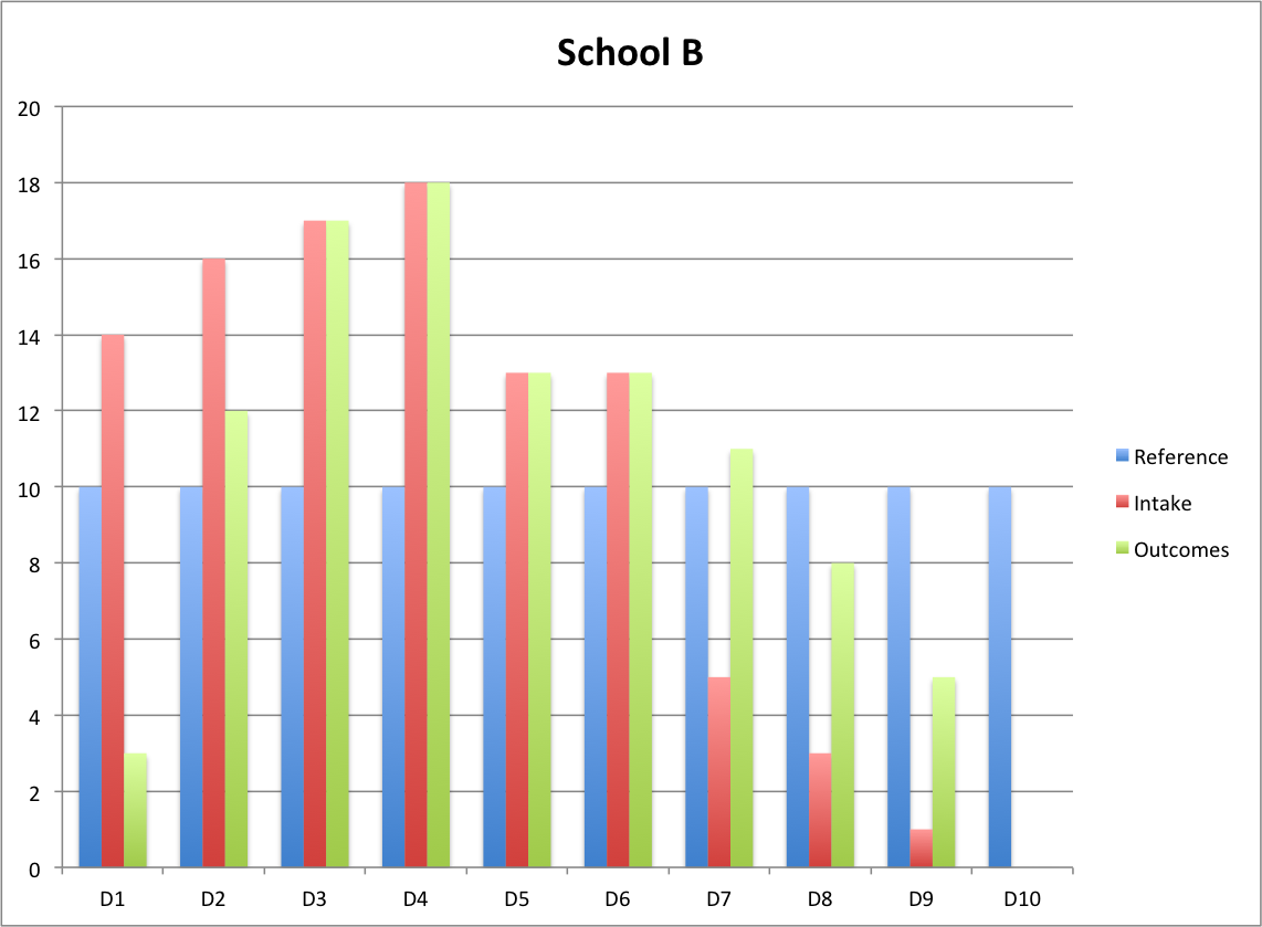
School B has an intake skewed to the lower deciles but still has quite broad range. The outcomes show a significant shift out of the lowest decile and strong improvement in moving students into the higher deciles. This school adds value and you can see where.
School C has an intake that is very close to the average national distribution. However the outcome profile is very different; the lower decile students make strong progress but the higher decile students fall back. This subtle picture would be lost in the averaging of Progress 8 that would probably be close to zero.

It would be possible to assign a numerical measure that averaged out this decile shift effect; arguably it would be similar to Progress 8 although it would skip over all the arbitrary data-garbage nonsense of fine levels and four sig-fig estimates of outcomes! But what would be the point? Are we really that interested in comparing schools in this way? The data profile would help schools to look at where they’re succeeding and not succeeding relative to the national trend. Parents and inspectors would get a better idea of the profile of the intake and outcomes as well as a feel for the pattern of progress in a way that Prog 8 = 0.3 +/- 0.2 utterly fails.
Sadly, the Progress 8 train is already running down the tracks. Our best hope is to chuck as many pinches of salt in its path as we can! And we should all agree to sound the DATA GARBAGE KLAXON any time someone says School A, Prog 8 0.4 has outperformed School B, Prog 8 0.3.
UPDATE 1: Dr Becky Allen has posted an interesting response for DataLab tackling some of my criticisms. I have then written a response. Essentially I am saying that this is more a matter of principle, disputing the validity of the concept of producing a single data point to average out the very nebulous notion of ‘progress’ – not one of mathematical methodology.
http://www.educationdatalab.org.uk/Blog/May-2015/The-hocus-pocus-of-Progress-8.aspx#.VUe0C2RVhBd
I’m also interested in the twitter responses and comments below that suggest a statistical significance test is entirely misplaced because there isn’t a random sample involved. Which means what? I’m not sure.. The idea that lurking in this fog is a ‘true value’ measuring progress is hilarious to me. We’re not talking about the height of plants over time….this is about as far from understanding learning as we can get.
Here is my comment on the DataLab blog:
This is an interesting response. It makes me realise that in highlighting my concerns via a discussion of the maths, I’ve given the impression that I dispute the maths itself. That’s my mistake. I totally understand that the fine levels would produce a correlation to GCSE outcomes that is virtually identical to raw marks; similarly I understand that keeping lots of sig. figs. in a mathematical calculation is useful to avoid overall rounding errors. The thrust of what I’m saying – or trying to say and possibly failing – is that at both the input and output stage we are assigning numbers to learning as if they are measurable to that degree and in that way. A fine level of 5.1 is really just a pure bell-curve marker; that’s it. Let’s not kid ourselves that the marks given for specific pieces of learning feed into that such that 5.2 signifies ‘better learning’ in a meaningful way. The same for Attainment 8 outcomes. Datalab has shown how huge the spread of outcomes is for any given starting point – and I don’t think averaging all this out to suggest a neat correlation as in that look-up table is healthy. It’s now a pure numbers game; we’re not talking about children and what they’ve learned. We certainly can’t be talking about school effectiveness surely.
Regarding the final point – Progress 8 doesn’t replace %5A*-CEM; it replaces the RAISEOnline VA score. At least %5A*-CEM is an actual thing – it measures what it says it does – regardless of the pernicious effects it has had. I’d suggest that Attainment 8 average totals (not reduced to approx grades eg C- which I find patronising) AND a profile showing the % of students scoring in certain ranges – or in deciles as I suggest in my blog – would be far better.
Let’s just run as far away as possible from this idea that one number can inform discussions about a school. My post was meant to shine a light on this – not to quibble about mathematical methodology per se. Once we forget that we’re talking about learning in complex human beings, we can do what we like with numbers. The least we can do is leave it at the maximum level of complexity we can stand so that we don’t squeeze out the meaning all together.
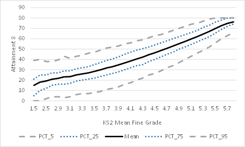
UPDATE 2: Education Datalab produced this graph after I made an enquiry on twitter. It’s plot of Attainment 8 vs KS2 fine level. It’s important to look at the scale of the spread. For example, the inter-quartile range (ie from the 25th percentile to the 75th percentile) appears to be about 15 10 for a KS2 fine score of 4.7. The scores for that middle 50% of students range from 45 to 60. Surely that puts the ‘precision’ of an average of 50.67 into perspective. Garbage? I think so. Of course there is a strong overal trend with limits for all to see – but the illusion of numerical precision needs to be fully recognised for what it is – an illusion.
UPDATE 3. Read this post from EduDataLab: http://www.educationdatalab.org.uk/Blog/May-2015/Why-do-pupils-at-schools-with-the-most-able-intake.aspx#.VU3LTNpVhBd
To me it is inevitable that this happens, because of the same virtuous circles of parental support, student attitudes and teacher confidence that results in higher KS2 levels continues up to KS4. Progress is a geometric effect, not an arithmetic one; it’s exponential, not linear. However, note Datalab’s conclusion. “Is the progress ‘boost’ due to the pupils themselves or due to something the school has done? The honest answer is that we can’t tell from the data we have available. And because we can’t resolve this conundrum it means that Progress 8 is not a measure of school effectiveness.”
Take note people; take note. It is NOT a measure of school effectiveness.

It always feels to me that, for many years now, there has been a need at government level to reduce performance to a single value of some sort in the name of accountability. %5A*-C is the example Progress8 is replacing, but Overall Ofsted grade is another example. I don’t think it’s just in education – A&E waiting times or the Public Performance Measure for train operators… there are plenty of examples. I think that partly this was an attempt to ape the ‘bottom line’ that allegedly drives the private sector to magnificent efficiency and performance, and maybe a crude but somewhat effective way to deal with genuine complacency when it is encountered on significant scale but it has become embedded and it is high time that it was recognised that these sort of measures and targets are just an obstacle (and far from a trivial one) for motivated professionals and self-improving organisations.
Time for another tweet?
“If there was no Ofsted, no Attainment8, no Progress8, just you and your school…what would you choose to do to make it GREAT? Do that anyway…”
LikeLiked by 1 person
The computer age means everything must filter down to an easily filled in box or number for swift Excel comparison. Nuance and qualitative judgements are simply too complicated & too time consuming to produce for the 21st century that demands pace & seeks to remove the imperfections of human judgement.
LikeLike
It appears that these measures are essentially a formalisation of the population-based prediction systems like those offered by the FFT. These should never be atomised and applied to individual students as concrete goals. But as you say. They always are.
LikeLike
Data is a great cloak, hiding the truths of progress. Could sport offer an analogy here? The great success of the As baseball team winning the World Series with cheaper, over-the-hill players, employed to play the game in a specific strategy, shows the power of statistics and algorithms when applied intelligently to achieve an agreed outcome (see book or film called Money Ball). This achievement was reached solely because a Harvard graduate accountant who loved baseball identified patterns and wrote the algorithm. Would it be beyond schools/government to provide the necessary training to each organisation’s data manager that would facilitate a more sophisticated data analysis system? No. Or, indeed, employ the data scientists themselves, at national level, and provide consistent analysis for all schools. Should this happen, is it a desirable outcome? Do you need this information? As the first respondent to this post said, think about what might make your school great and do that.
Nice to see you’re back.
LikeLiked by 1 person
The problem with the number of significant figures is not that there are four; this is fine, as long as the statistics are not thought of as applying to single students. All the data points do is define the trend, around which there is inevitable scatter. It is true that this scatter is greater from some starting points than others and that therefore affects the reliability of the indicator if it were to be applied to a single student.
The progress 8 measure offers a simple metric that measures an aspect of school performance. It should not be used in isolation, and I would hope it would not be. Schools have access to such useful tools as the separate subject transition matrices, which go some way to the sort of group/distribution data that you discuss, and which schools are at liberty to use and to present to Ofsted inspectors. They would be foolish not to.
Data promote questions. They do not necessarily provide answers. Problems arise with data when people do not question them or drill down to underlying causes. No particular metric is indefensible, per se, including progress 8. It is the uses to which data are put wherein lies the heart of the problem.
On a separate issue, the 95% confidence interval does not mean that there is a 95% chance that the true progress 8 measure lies in this range. The progress 8 measure has a true value (in theory) that either is or isn’t in this interval. What the 95% confidence interval tells us is that if the progress 8 measure is calculated using this same method many times (i.e. by getting students to retake the tests again and again and repeating the calculation), then the (differing) confidence intervals will contain the (constant) true value 95% of the time. The difference may be subtle – and requires some thining about – but it is real and demonstrates, perhaps, the need for rather more than GCSE statistics to undertand fully.
LikeLiked by 1 person
Thanks Simon. I get that about the stats in terms of pure Maths – the 4sf and the 95%. But the confidence interval is so big because the spread for each fine level input is huge. Too big to go anywhere near 4sf even part way through a calculation. We’re talking about complex learning gains and this approach loses sight of that totally. The fine level calculation is arguably the biggest flaw; each original mark has a different ‘size’ in terms of learning but it’s treated as a mathematically precise truth that Child A is represented by 5.1 and not 4.9 despite arbitrary decisions about boundaries for levels. A ‘true value’ for P8 just doesn’t stack up conceptually as far as I’m concerned. I agree all data tells you something but sadly P8 will be given way too much weight.
LikeLike
Your final point is the one that is of true relevance. As I originally said, I have no problem with the idea of mapping from KS2 to KS4, and doing it as accurately and carefully as possible, in a statistically correct manner. The problem is if Progress8 is used indiscriminately and in isolation, and if it is applied in an unthinking way to individual students. The spread in the data – encoded in the confidence interval – is large for two reasons: the initial assessment is imprecise, and progress varies from student to student. However, if the P8 score for a school is significantly low, in a statistical sense, and taking in to account the large confidence intervals, it is right and proper to ask why, for the sake of the students.
LikeLike
hello
This is a great post. I fully support the central message.
I’m no stats man but my understanding is that it is inaccurate to use the term statistically significant with this data. That phrase carries a particular meaning: that the data is being compared against a random sample. School data like this us being compared with a population.
That to one side I think the whole data-led approach is part of a positivist fantasy that reduces reaching and learning to a socially decontextualised technical process.
This disregard for stats worries me. They are playing around with complex processes, pretending they are measurable. Not very clever!
LikeLiked by 2 people
“One number representing EVERYTHING a student has learned at KS2”
—
Plus ça change: my Y7 daughter’s end-year targets for all but one academic subject (maths which is the only subject they set in Y7) are based on a murky APS for RWM converted back to ye olde level:sub-level, plus two sub-levels. Murky to me because it’s derived from fine point scores from the Reading and Maths SATs, but the whole level points from the teacher-assessed Writing despite that being reported to parents with sub-level granularity. Then entertainingly the Maths SAT contributes to English prediction, but not the SPaG SAT.
I would love to know more about how and who they tested re. more nuance. In cases where there is some interest amongst the mixed bunch of parents around here, they have inevitably been focused on what happens to a child much like theirs.
This stuff is not what I expected. KS2 assessment was/is(?) supposed to output standard scores, but for progress we’re faffing about with what look like NC levels but with a decimal place rather than a/b/c? I vaguely expected we’d get something like those deciles, although perhaps stanines for conceptual overlap with CAT score world etc.
LikeLike
Millions of pupils have passed from primary to GCSE so we have a lot of information to tell us the likely Attainment 8 results of pupils with specific fine points: down the accuracy to two decimal places
its arguable whether providing figures to two decimal places is counterproductive as it’s a level of detail that just seems to baffle, this could have been rounded up to one decimal place, but would lose detail
LikeLike
I get all the stuff about the numbers. It’s not about being baffled by detail or numerical precision; it’s about the loss of real educational meaning. A fine level is arbitrary and flawed; the Prog 8 scale is an artificial construct that bears almost no resemblance to aggregating progress in learning.
LikeLike
New primary assessment. Reformed GCSEs (which I dearly hope have higher ceilings). Inexplicable rises in floor level thresholds for which the most credible explanation is political convenience. Comparable outcomes. And so on.
Can you explain to a puzzled parent why five year-old data will (honestly) predict my Y7 child’s GCSE results with that precision?
LikeLike
We know KS2 predicts GCSE because we can look at what happened for many years. There is a much stronger link between KS2 and GCSE than is commonly found between a lot of things we think are linked, like smoking and life expectency. Consequently, we know KS2 is a powerful indication of what GCSEs will turn out to be.
Better not to think of the two decimal places as precisely those exact figures, rather they are figures results are likely to be near too.
LikeLike
are Key Stage 2 marks arbitary? surely that all depends on the the quality of the Key Stage examination, Key Stage 2 is the dedicated work of thousands of professionals not sure it can be dismissed readily
LikeLike
The arbitrariness is in a) the size marks and b) the level points. In the example 74 is a L4; 77 a L5. None of this is a truth – it’s a fabricated scale. Fine Level 5.1 suggests a degree of precision that simply isn’t real.
LikeLike
But we have to invent a scale as none exist, like we had to for temperature. Key stage 2 examination is well regulated, hardly arbitrary
LikeLike
“Key stage 2 examination is well regulated, hardly arbitrary”
—
Not all of it. In 2014 the examination instruction booklet for the KS2 L6 Reading SAT was significantly broken, however that’s not obviously why the pass rate also plummeted to roughly **half** of the previous years. To date that pass rate has been very small so it is a small minority interest, but in a well regulated system one would still expect the regulator to say something, but alas…
LikeLike
Reblogged this on The Echo Chamber.
LikeLike
Schools are already playing the Progress 8 game. As 3 of the 8 slots are reserved for EBacc subjects SLTs have recognised that SEN students who may not ordinarily opt for EBacc may adversely affect their Progress8 score. Therefore these students have been encouraged to take EBacc subjects. A school near me has the whole of Year10 taking Triple Science. It might not be in the interest of the student but it makes the data look good!
LikeLike
I am glad that somebody has finally woken up to the reality of Attainment/Progress 8 -the measure which is there only to serve an ideology and not education of our children. I recall how the headteachers praised the new measures as being fairer to the students and schools. Bring back 5A*-C and the best 8 VA- at least we had something to work with and still teach a broad and balanced curriculum. The only advantage of progress 8 would’ve been the removal of a magic C grade. However, this is not true. The Raise on line will be again all about English, maths and Ebacc subjects which still need a grade C and above to count! This is hugely disappointing as not only a very large number of children who don’t do two sciences, or MFL or History or Geography or any of the above will be penalised , but they will likely to be the most disadvantaged or SEN students. These measures will create an even bigger social divide than we currently have in this country. A backward and ill -thought out measure.
LikeLike
comment on Update 2: I think you are articulating an issue many have with what averages represent, you attribute two decimal places to precision because understandably you think of numbers from an arithmetical tradition where a number is that specific number and no other, as if progress 8 is saying is that a child with KS2 of 4.7 will get Attainment 8 of precisely 50.67 and not one thousands lower or a one thousands higher. But what Progress 8 is saying is that a child with KS2 of 4.7 is most likely to get Attainment 8 score somewhere in the vicinity of 50.67. The average is more than an approximation and is useful because the likeliness of a score increases the closer it is to the average figure. So the average number itself represents the middling score in a spread of scores, thus it’s descriptive for likeness, a complex shape of how scores pile up around a most common range of scores (just like your graphs). The problem your intuition rightly picks up is that the average figure alone (descriptive of the middlinglyness) is not enough to understand how good or bad a score is relative to this average. You also need to know how spread out the scores are because if they are spread out a lot a score quite far from the average is likely but if they are not spread out much a score quite far is unlikely. So you really need to know the distance a score is from the average – relative the distance most scores from the average.
Averages represent a tendency, piling up, heap, clustering, blob, sleu or spread of scores, not a precise anything. You can’t describe a complex tendency like a pile of sand with one number and an average is just a guide, one number that is the most useful shorthand to help understand central tendency.
LikeLike
To be honest, that is quite obvious to me. An average is an average; an approximation, yes. Even more reason to dispute the idea that, by keeping 4sf for each of these averages in calculating the differences for each student – and then averaging the differences for the P8 measure – we are getting a ‘truer’ value. Given that we’re measuring progress in learners, there is nothing meaningful about 4sf at any point – except in mathematical terms. Even if we were measuring pencils with a standard mm ruler, we’d have to be cautious talking about average ruler lengths of 12.35 mm based on an average of multiple measures…it simply wouldn’t be valid, given the measuring tool.
LikeLike
This is an important conceptual leap many struggle to make with averages. If 1 pint of milk is delivered on Monday and 2 pints of milk on Tuesday the average milk delivered is 1.5. This seems counterintuitive to some because at no time was 1/2 pint of milk was delivered but by dividing the milk deliveries by the number of days you are no longer talking about the real world of milk instead you are now talking about the relationship between milk delivered and days.
Progress 8 finds the average Attainment 8 for pupils on a given KS2 result, the average Attainment 8 is not Attainment 8 in the real world it is the relationship between Attainment 8 and all Attainment 8 results.
It is confusing that we have to deal with two different senses of Attainment 8, one is a real world version achieved by actual results and govened by the laws of discreet indivisiable arthimatic, the other is a relation between a group of results and is govened by the laws of relational maths.
LikeLike
I know. I get that. But averages have limits especially when the origins are non-numerical. There would be a point at which 1.344 pints of milk would be a pointless degree of precision. Even more if you were working on the Taste Factor or something. This is ball-park territory.
LikeLike
[…] The examination and curriculum changes take up a lot of institutional energy and, above all else, we simply need time to get those things right. I’m actually quite happy about the move to terminal exams and the removal of the less robust elements of GCSEs: the ‘discourse of gaming’, as Brian Lightman has called it, never did us any good. I’m looking forward to 2018 when all the GCSEs have converted and we’re not dealing with year-on-year tinkering to performance measures. I hope you’ve been briefed on the statistical limits of Progress 8 and understand that it is not a measure of school effectiveness per se. (I’ve got quite strong views on this.) […]
LikeLike
The power of averages comes in because if you have a very large number of measurements such as all milk deliveries ever, then the average will be a good reflection of all the typical results.
Say one person orders 100 pints but 99 people order 1 pint the average pints of milk delivered is 1.99. The average is twice the most common milk order, that’s because the one extreme order is the same size as the total of all the other deliveries.
But if you have 1000 deliveries and one person orders 100 pints and 999 order 1 pint then the average delivery is 1.099. Much closer to the most common milk order. That’s because with a larger sample size the one extreme result is a smaller proportion of all the results. Indeed, arithmetically the effect of individual results is in proportion the results divided by the size of all results. So if you have a lot of results the average becomes very sensitive to the trend in most results and very insensitive to a few freakish results.
In a school of say 100 GCSE pupils all taking 10 exams one pupil would need to pass 1000 GCSEs to double the school average.
So if you had data on all milk deliveries ever, millions and millions of households and average milk order of 1.344 pints could only be altered by either by some milk orders that were so large they were a substantial proportion of the all the milk ever ordered or by all milk orders changing for substantial proportion of the time as you had been collecting data (e.g. since the war), so you would need to keep collecting data for 60 years to see the average change.
Progress 8 looks at the average Attainment 8 of millions of GCSE pupils in ten of millions of individual examinations, for that average e.g. 50.67 to move even one thousands a substantial proportion of all the results of pupils who got 4.7 at KS2 ever recorded would have to be different or a small group of pupils would need to take as many GCSE as many millions of pupils since the turn of the century.
Thus averages of large amounts of data are hugely sensitive to the common trend and hugely insensitive to a small number of results they can therefore talk about the kinds of precision of two decimal places.
LikeLike
To be honest I think this is losing the plot. 4.7 isn’t an absolute state; and 50.67 is an average of thousands of numbers on a made-up scale; ‘progress’ from one construct to another has no ‘true value’. Let’s end there. Thanks
LikeLike
I agree, Tom.
I’m also an educational researcher. Data as opaque as this concerns me. Particularly as it seems to encourage teachers to focus on numerical data relatng to assessments and test scores rather than, say, teaching real students and addressing their educational (and often personal) needs. The data-driven cultures around education have taken a grip in primary schools, secondary schools and in colleges. They have led to various forms of gaming. They distort the educational experience rather than improving it (which presumably they are supposed to support). Above all, to talk about results using an analogy of bottles of milk troubles me. It ignores that we are dealing with a social and relational process, rather than managing a production or delivery process. I am a secondary governor and have experienced the blank looks of most governors when confronted with Raiseonlne and other data. Truth is, it needs heads to interpret and provide a narrative. Otherwise there can be a worrying positivist perspective that ignores contextual, qualitative data.,
LikeLike
Why are you talking about milk.
It is no longer relevant in education.
Thatcher (the milk snatcher) saw to that
LikeLike
[…] school chosen at random. Tom Sherrington has chosen to criticise one – Progress 8 – in his blog and propose another – a comparison of the distribution of attainment by intake and by […]
LikeLike
Warren cut straight to the heart of this in the second comment on this thread. RAISEonline was the archetype. Data collected for CRM purposes, simply reskinned and marketed to a gullible, lavishly funded quango with a political agenda.
If what we want is an improved system overall, we know that teachers’ performance is where we can have most impact. This is why at the recent Academies Show, I suggested anyone serious about improving a school should be measuring what teachers do (not what children achieve) in terms teachers agree and understand, at an individual school level, because we also know that “improvement above all entails learning to do the right things in the setting where you work.”
LikeLike
[…] more recent post about Progress 8 is rising up the charts – another in the line of data delusion/garbage posts I enjoy […]
LikeLike
Excuse my ignorance but could you explain which data is used to allocate a student to a specific decile and which national data is used to derrmine each decile.
LikeLike
Hi Ian. Currently this doesn’t happen. I am suggesting that it should. Any data set could be processed into deciles; Ave KS2 scores, Attainment 8 scores. It would help to give a school profile on intake and outcome which tells us more than an average of averages.
LikeLike
what you’re striving for with the deciles is see how outcomes spread out, your instincts tell you that all the important information about performance is represented in the shape of spread, averages are intended to do that in quick and easy way, they show where the spread peaks
LikeLike
[…] Tom Sherrington http://headguruteacher.com/2015/05/02/progress-8-looks-like-data-garbage-to-me/ […]
LikeLike
[…] details of Progress 8: Looks like Data Garbage to me, by […]
LikeLike
I’m amazed by how well you’ve articulated the very real concerns that I shared on this after reading the P8 technical guide for the first time.
The point has already been made below about comparing this to FFT predictions, which if you read the technical blurb on the confidence intervals there basically says that there is X% chance of the student getting that grade (e.g. B in old money) or the grade above or below – so actually A, B or C! In core subjects there’s 90% confidence, foundation 80% and the rest 70%… So when we say a target grade using FFT GM data in PE we’re actually saying there’s a 70% chance of a 1 in 3 chance that student will get that grade! And by the way, we’re going to hold you to account if they don’t! Progress 8 has massive elements of this as the overlapping confidence intervals have been totally overlooked by a lot of people.
I think the idea of decile performance is a very good one as at least that seeks to separate out the issues. This reminds me of the methodology used by ALPS, which I think works quite well. Would surprise me if they start moving into KS4 to be honest. We could live in hope that something like your decile graph sneaks into RAISE when it’s published. The other reason I like that is because it helps to create more transparency when you compare schools Attainment 8 scores, which I’ve said from the word go will be the reference point for parents as they will understand an average C- better than a -0.16. This still boils down to cohort strength on entry and selective schools will still reign supreme in this measure. At least, in theory, Progress 8 levels the playing field.
The last point is that all these estimated outcomes have been extrapolated from retrospective data from a time before schools started changing their curriculum to satisfy this new system! I think there will some huge changes in outcomes in that second EBacc bucket as more schools wantonly enter low/middle ability students for three EBacc subjects, whereas previously they may have only done core and additional science. Not saying this is a bad thing, it’s just difficult to predict how that will shift the sands on these “attainment estimates”.
The thing that does give me confidence though is that Ofsted inspectors are not all statistical wizards and so when it comes to sitting across the table from them to discuss this when the visit comes, I fancy our chances.
LikeLike
Interestingly Alps is moving into KS4 and the RAISEOnline contract is up for tender in Jan 2017 – they don’t know what they are reporting on after this years results.
I always imagined that RAISEOnline employed masses of data gurus working on the document that all schools are accountable to – but no. One – yes one, full time employee and a couple of bought in externals. Was pretty shocked when they explained this at an ASCL conference.
LikeLike
I am shocked by that. It’s back of envelope stuff.
LikeLike
[…] of the most read blogs of the year featured my exploration of Progress 8. Progress 8 – Looks Like Data Garbage To Me. I enjoyed the responses from Becky Allen at Datalab. It certainly needs a giant pinch of salt. […]
LikeLike
Only one thing is required for anyone to stay to make sense of this: a clear statement of the null hypothesis that is to be tested. What is the null hypothesis?
LikeLike
[…] Tom Sherrington […]
LikeLike
[…] born and looks like its here to stay, there’s no use wallowing for too long in outrage at the data-garbage bonkersness of it all. We might all agree that averaging out every child’s achievements across the school via […]
LikeLike
I love your decile shift graphs. I’m working on providing a feature to generate some automated reports for class analytics within Rise.global
I also want teachers to be able to see how all deciles have performed over a period rather than just the crude average change in score.
One question I have though: while I get that you are comparing average score per decile between two points in time – but is that the same group of students from the start of the period or is it just the decile that you are comparing? Since clearly students may move between deciles during that time period, individuals may come and go. Within small class sizes this might then create significant distortion in the results.
LikeLike
I had in mind that this would be comparing only students present for both entry and exit.
LikeLike
[…] earlier blog : Progress 8: Looks like data garbage to me – where I explore the convoluted P8 mechanism and the tenuous link to any actual […]
LikeLike
[…] statistical problems with P8 have already been very robustly covered by others, as has the unpleasant way in which it pits schools and their pupils against each other in a drier, […]
LikeLike
[…] https://teacherhead.com/2015/05/02/progress-8-looks-like-data-garbage-to-me/ […]
LikeLike