As most people recognise, when evaluating the degree of success in a set of GCSE outcomes we need some sense of the baseline before we start making like-for-like comparisons. At the risk of stating the obvious, how well we’ve done all depends on what our results look like relative to the prior attainment of the students. This applies to comparing whole schools, year-on-year comparisons for one school, subjects within schools and teaching groups – especially if they are set by ability.
Given how long various data tools have existed and how commonly they are used, it still surprises me when school leaders, subject leaders and teachers refer to raw outcomes but don’t automatically engage with a banded analysis. Using national transition matrices is a really good way to give a nuanced, stratified analysis of outcomes compared to national trends in all subjects – and I’m sure many of you will do this as a matter of routine. However, my feeling is that all teachers would benefit from engaging with data at this level, not just have it presented to them by data managers; it’s not a mysterious process and it pays to get a feel for it. It can be a powerful exercise to engage with in a departmental meeting where teachers look at their data collectively.
I found this excellent post from @DataEducator today, http://dataeducator.wordpress.com/2014/03/23/interacting-with-the-interactive-transition-matrices/ and that has led to messages from @KristianStill who discusses the issue on his blog: http://www.kristianstill.co.uk/wordpress/2014/03/22/u-turn-on-interactive-transition-matrices/ . Evidently ASCL has also produced a sophisticated transition matrix tool to help schools although it appears to require membership login to access it.
In this post, I am going to outline my approach. The origin of the data is the national data set mapping KS2 sublevels to GCSE outcomes. Of course, all of the data has error attached – you need to approach this process intelligently, recognising the limits of its validity. (Sublevels carry a data delusion health warning but we have to work with what we’re given). You are looking at an average pattern for the whole country and then lining up your very specific cohort of students against it. It’s not an absolute indicator – it is simply a tool to identify possible issues or successes based on the trend observed when one bell curve is lined up against another, with five years in between.
Transition Matrices for 40 subjects are now provided on the OfSTED RaiseOnline site:
At first glance it can be overwhelming but if you select your particular subject and start to think about your own cohort or even your own class it starts to make sense. I have chosen Geography to illustrate the process.
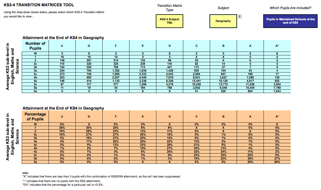
The national data maps average KS2 sub-levels in English, Maths and Science to GCSE grades for all students who took Geography. The details fluctuate from year to year but not by much – because of the bell-curve effect. This information can be used to work out how well your Geography students have done compared to the national trend for all Geography students, based on their prior attainment at KS2.
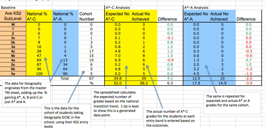
I have produced this spreadsheet to help with the analysis. It focuses on two outcomes that I am interested in: grades A*-C and grades A*-A. As we move away from A*-C thinking, with P8 and A8 on the way, it’s really important to consider a range of outcomes.

You can download it here to use as you wish: GCSE TM Analysis Template
The only work that needs to be done extracting the data subject-by-subject is to add up the percentages for the outcomes you want to focus on. I am interested in A*-C but also A-A* so I have compiled that data from the master matrix. That allows me to look at top end achievement from all groups alongside core achievement. The spreadsheet calculates expected outcomes – essentially the grades expected if every student performed in line with national trends. I deliberately keep in the decimal points to highlight the fact that this is a calculated outcome – you don’t get 4.8 students of course.
Once the national data is in place for a given subject, you can enter your school data, for a class or whole cohort. By comparing actual with expected grades overall and for each band you get a measure of how well a class or cohort has done relative to the national trend. There’s no use getting excited about lots of As and A*s if that is simply what was expected. Similarly, this method shows up any major achievements with lower prior attaining intakes where the raw outcomes may be less dazzling at first glance. Obviously not everyone can be above average but any outcomes above what is expected is a sign of adding value. At the same time, you need to be careful not to overload expectations. If only 4% of a 4b KS2 band gets an A/A* at GCSE it means it is possible but relatively rare. Leaders need to be careful not to turn this into a false expectation. (Let’s be intelligent and realistic as well as aspirational.)
I’ve always found that this analysis is helpful in getting an idea of the structure of a set of outcomes, way in advance of the publication of the RaiseOnline analysis. It shows you if you’re doing well with the top end, the bottom end or simply keeping in line with the overall national trend – which is no disgrace. It’s important to be careful with small cohorts; the patterns are much more meaningful and secure with larger numbers, although it’s still worth having a look to see what the analysis shows.
As well as undertaking a retrospective analysis, arguably it is even more important as a tool for setting expectations for current groups.
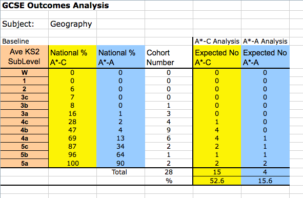
In this example I have collated the data for a hypothetical class of 28 Geography students. It suggests that 15 students should be gaining at least a C and 4 should be gaining A/A*, on average. Any teacher ought to be able to do this for their own class. It helps to put projected outcomes into perspective, compared with national trends. It could serve as a way to set minimum goals for a class. Of course, there is the possibility that many more top grades could be achieved so it’s important for this analysis not to ever limit expectations; it’s simply a way to establish the national trend line as it applies to a specific group.
If you are interested in looking at whole-school outcomes in terms of 5A*-C EM, while that remains the key performance measure, there is a transition matrix for that too:
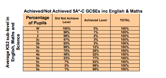 You can use this data to calculate the expected 5A*-C inc EM for your school either in a predictive way or retrospectively. After a period of turmoil, as we’ve had this summer, the exact details may vary a little more so it may be worth waiting for the 2014 data to be published. However, that can take many months so the 2013 data could be used to give a reasonable rough estimate.
I’m going to suggest that we explore some of this thinking at my school. Once teachers have met their classes and can reference prior attainment data against their own assessments, an exercise like this can be very useful to prompt discussion about potential outcomes across the ability range within any given year group or teaching group. When levels finally disappear from KS2 tests, new transition matrices will emerge using whatever assessment outcomes are generated by the new tests. The same principles will apply.
UPDATE December 2014: The new matrices are now available:
https://www.raiseonline.org/documentlibrary/ViewDocumentLibrary.aspx
The 2014 TM for 5A*-CEM is much more generous than 2013 – at least it is for my school. It may be worth recalibrating your analysis.

[…] As most people recognise, when evaluating the degree of success in a set of GCSE outcomes we need some sense of the baseline before we start making like-for-like comparisons. […]
LikeLike
Reblogged this on The Echo Chamber.
LikeLike
Hi Tom,
One thing I like to do is add a column that shows “one students percentage worth”. This helps you to see whether any variation may be down to 1 or 2 students. I find this really useful when looking at groups, like Pupil Premium, or in the Sixth Form where we have small cohorts…
Thanks, Neil
LikeLike
“Data error” unfortunately applies to outcomes as well as input. This approach looks very good, but until a proper system of final assessment is in place, it will be subject to abuse due to pressure on teachers to ensure that pupils get the expected grades. Pressure corrupts, and I don’t trust internally generated data without cross-checking it against pupils’ work.
LikeLike
[…] Edssential article from @headguruteacher : […]
LikeLike
I really like this approach and would like to fully embed in my school. Do you know if you can get similar data sets for Wales?
Thanks
LikeLike
Hi. I really don’t know. I assume so.
LikeLike
[…] http://headguruteacher.com/2014/08/26/gcse-outcomes-and-transition-matrices-a-data-tool-every-teache… […]
LikeLike
Reblogged this on paddington teaching and learning.
LikeLike
I really don’t want this comment to be perceived as a primary vs secondary thing, but when I first encountered these transition matrices I was shocked beyond belief. In my naïveté I had assumed that 4c yr6’s would most likely go on to get c’ s atGCSE, 4b’s b’, 4a’s a, and anyone who got level 5’s across all 3 subjects in yr6 was seriously clever and would romp home will fistfuls of a*’s. And that schools would of course want to beat that so the 3a’s got c’s, the 4c’s got b’s etc.
I still don’t understand why the national figures are so adrift of this. A child who gets 4a in all 3 subjects should (adolescent catastrophe aside) find getting an A not easy but well within their grasp. They are capable kids. More of an uphill struggle for 4c’s to get a c, as most likely they have been heavily ‘ intervened’ with in primary to haul them over the finishing line…but then again I had expected these we the group that formed the c/ d intervention group in secondaries. By the way, having two teenage sons I am pretty familiar with the specification of gcse in English, maths and science, having helped them do many past papers- although I confess not so much for geography. 4bs are middling ability students, so I’d expect a B grade – a middling grade – no? ( using ‘ ability’ as shorthand for ‘ prior attainment’ and without being too crudely deterministic).
For what it is worth, I’ve been doing appraisal target setting this week and asked all my teachers to bring along a completed matrix on which they had set targets for their class based on either end of ks1 data ( for ks2 teachers) or fsp ( for ks1). Teachers are expected to set targets so that almost everyone will have made at least expected progress and at least a third more than expected. After all,that’s what happens nationally. Really I’d like more than expected over 50%, but with the stupidity of performance related pay I’d never make that an appraisal target. The early years staff also set targets based on ages and stages, although these are used much more as a tentative starting point for discussion.
So secondary colleagues – honest question- why don’t you routinely convert very able yr 6 pupils to a’s and a*’s etc.?
LikeLike
The answer is simple: The bell curve. Grades are not absolute measures; they are referenced against a distribution. There are more spaces above 4a at KS2 than there are spaces of A and A* at GCSE. It’s as simple as that. You’re asking for more something akin to saying ‘everyone should be above average’. And then there is the issue of the curriculum breadth at KS2 used for the assessment of those levels; it’s far narrower than the equivalent at KS4. But the main thing is just the statistical impossibility.
LikeLike
A grade B is only “a middling grade” if A – C are the only grades considered… Level 5 to an A, 4 to a C and 3 to an E is much more realistic.
LikeLike
I use these matrices as a guide for expected progress as well, by adding up the relevant columns in the sheet and graphing. English shows the sawtooth shape you’d probably expect but history is more of a J shape, showing it is much harder for L3 students to make ELP in history than it is in English – even though they might be considered similar type subjects. Subjects like art can be nearly flat (equal probability of ELP for all ability students).
It’s only a guide because there are differences in correlation coefficients for the transitions, and also the cohort ability range may not match that of the national data (e.g. There are more high ability students in the national data set for separate sciences than we will ever see in our school), but nonetheless it does highlight the fact that you can’t expect all abilities and/or all subjects to hit 70% ELP.
I can’t work out how to paste the graphs in here but am happy to send the sheet via email if you want to see what I mean without the effort of doing it yourself, although it’s a relatively trivial task.
LikeLike